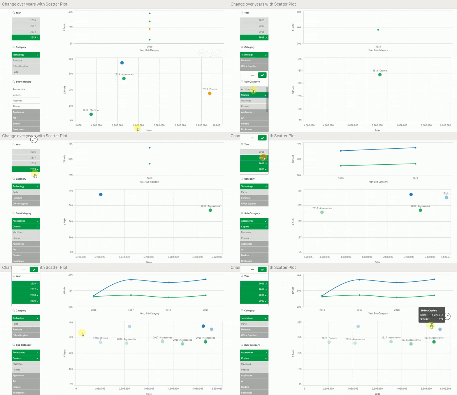
#42 📅 Change over time in Scatter Plot in Qlik Sense
Visualize change over time with Scatter Plot 📅 Using gradient color by dimension
I really love Scatter Plot, really!
If I would keep one chart, it would be a Scatter Plot
No it won't be the Pie chart 😉
It's so powerfull to compare values over two measures
As I showed in #41 🦸♂️ IMPROVING SCATTER PLOT IN QLIK SENSE, you can enhanced it with lines and colors
But what if you want to analyze change over time?
In my example, I want to compare categories and see how sales and % Profit are going over years
I did it using a calculated dimension with Year and custom colors with argb() and the Pick(Match()) trick 🧙♂️
Another way to enhance your Qlik Apps
I hope you like it !
Download QVF
Sheet Change over years with Scatter Plot
⁉How to ⁉
First, this kind of chart should be used in a guided analysis scenario, to reduce the data to a small dataset
Then, as a dimension concatenate with :
Year&' : '&[Sub-Category]
set color by expression
The gradient color to make it darker in the most recent year is based on :
255/( Max(total Year)-only(Year)+1)
Pick(Match()) trick looks like:
Pick(Match([Sub-Category],$(=Concat(distinct chr(39)&[Sub-Category]&chr(39),','))),
argb(255/( Max(total Year)-only(Year)+1),39, 174, 96),
...
And any add other colors
Cheers

